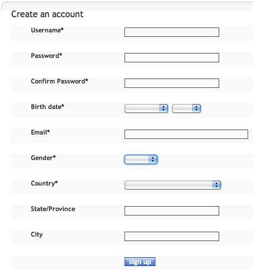
Looking to get the best bang for your sign-up form’s buck? There’s a lot that goes into conversion rate optimization (CRO) for web forms. Here are the best, most
essential tips for getting the most business you can from your online sign-up forms, whether they’re on a contact page, website homepage, PPC landing page, or anywhere else.
1) Keep it simple!
Online sign-up forms are definitely one area where less is more. Every field you ask your potential leads to fill out is one more opportunity for them to decide it’s not worth the effort and drop out. This isn’t just common sense; it’s borne out by the facts as well.
Numerous studies have showed that more form fields correlate directly with a lower conversion rate. This study by HubSpot shows a conversion rate of over 25% with 3 form fields dropping to less than 15% as the number of fields approaches 10. Another study found that conversion rates increased 120% when form fields were reduced from 11 to 4. The moral: only include fields that are absolutely necessary. Name and email address? Sure. Mother’s maiden name and date of birth? Maybe too much to start with.
2) Keep it simple, part 2: password rules
How many times have you seen something like this?
- Password must be between 8 and 17 characters long
- Password must contain at least one upper case letter
- Password must contain at last three lower case letters
- Password must contain one special character
- Password must contain one number
- Password must not match your username or birthdate
It’s frustrating, right? If your onboarding process involves getting your customers to create a password, more password requirements mean more drop-offs. While password security should definitely be a priority, arbitrarily demanding that users include a string of characters that has never before existed doesn’t so as much for safety as it might seem, and definitely tests people’s patients and attention.
Another password-related tip: password masking in signup forms encourages typos and decreases conversion rates. Throw your users a bone and let them see their password when they’re typing it for the first time.
3) Take the steps, or: you break it, they buy it
Even once you’ve whittled down the number of fields and password requirements to the bare minimum for your business, you still might find that your signup form seems a little cluttered. If that’s the case, consider breaking your form down into steps.
Step one could consist of entering contact info (to ensure users at least end up in the widest end of your sales funnel), with step to being a prompt to create an account and step three being final payment information.
While all of this information might appear overwhelming and discouraging to users on a single page, broken down it seems far more reasonable, and the more concrete feeling of progress that comes from moving from form to form could encourage users to stick with it.
4) Keep it above the fold… or should you?![Man with coffee using tablet with stylus to browse the web.]()
For those not in the know, “the fold” is web design speak for the point below which users have to scroll to see content. Common wisdom holds that users are more likely to engage with a form or other content that’s above the fold on any given web page. Makes sense, right?
Not always! Many marketers have found that forms placed below the fold actually improve conversion rates. In some cases quite substantially – think improvements of 220% or more than 300%.
That doesn’t mean you should definitely place your contact forms below the fold though. Different types of pages have different best practices (a form below the fold on your site’s homepage might be one thing, but one a PPC landing page this wouldn’t be a great idea). The best thing to do is to try different things and see what works best for you. This leads into our last piece of advice…
5) A/B: always be testing
A/B testing, or split testing, is the practice of serving users one of two different versions of a webpage, landing page, or form and comparing their relative effectiveness. Best practices can be more or less consistent across the board, but your company’s customers and leads are unique and will respond differently than others.
The best way to optimize your conversion rate is to find what works best and stick with it. Try creating two different versions of a sign-up form and setting them up with two different PPC campaigns. When the campaigns have concluded see which form behaved better, and move forward with that knowledge. Continue tweaking and evolving your forms (and other content) to get the best return. Even something as simple as changing the text on your submit button from “Submit Your Form” to “Start Your Trial” or “Let’s Get Started!” can drastically affect conversion rates. Test every aspect of your forms and landing pages, and over time you’ll have what truly works best for you.
Once you’ve mastered the art of the conversion, you can effectively handle your billing, communications, paywalls, and other membership management tasks using the simple SaaS of Subscription DNA. Learn more by filling out the expertly-crafted form below:


